Landing Page Optimization for Google Ads That Converts
Turn Google Ads clicks into leads: message match, page speed, trust signals and A/B testing. Practical landing page tactics with before/after examples.
Landing Page Optimization for Google Ads: CRO Guide 2025
Reality: Same ads, better landing page = 2-3x more conversions! Most spend thousands on ads, but the landing page is a disaster. This guide shows how to optimize landing pages for maximum conversion rate.
Why Landing Page Optimization is the highest ROI lever
Example "before/after":
Before optimization:
Budget: €5,000/month
Clicks: 2,500
Conversion Rate: 2%
Conversions: 50
CPA: €100
After optimization (same ads, same budget!):
Budget: €5,000/month
Clicks: 2,500
Conversion Rate: 5% (+150%!)
Conversions: 125 (+150%!)
CPA: €40 (-60%!)
The difference: €0 more budget, 75 more conversions!
Better than:
- New keywords (more expensive)
- Higher bids (more expensive)
- More budget (more expensive)
Landing page optimization = free performance boost!
The Anatomy of a High-Converting Landing Page
7 Essential Elements:
1. Headline (most important!)
Job: Attention + Relevance in 3 seconds
❌ Bad:
"Welcome to our website"
→ Generic, no value
✅ Good:
"Nike Air Max 2024 - 30% Off Only Today"
→ Specific, clear value, urgency
Formula: [Product/Benefit] + [Unique Value Proposition] + [Urgency/Social Proof]
Examples:
E-Commerce: "Free Shipping on Orders Over €50 - 30-Day Return Policy"
B2B SaaS: "Automate Your Accounting in 15 Minutes - Free Trial"
Lead-Gen: "Free Kitchen Quote in 24h - 500+ Satisfied Customers"
2. Subheadline
Job: Expand headline, more details
✅ Good:
Headline: "Nike Air Max 2024 - 30% Off"
Subheadline: "Limited stock - over 10,000 satisfied customers. Free shipping from €50."
3. Hero Image/Video
What works:
- ✅ Product in use (not just product image!)
- ✅ Happy customers (social proof)
- ✅ Before/After (transformation)
- ✅ High resolution (min. 1920px wide)
❌ What doesn't work:
- Stock photos (generic models)
- Blurry images
- Irrelevant imagery
Video: +20-30% conversion vs. just image!
- 30-90 seconds
- Show product in use
- With customer testimonials
4. Call-to-Action (CTA)
Job: Tell user what to do
❌ Bad:
"Click here"
"Submit"
"Continue"
✅ Good:
"Get 30% Off Now"
"Start Free Trial"
"Get Free Quote"
Best Practices:
- Action verb ("Get", "Start", "Download")
- Benefit mentioned ("Free", "Now", "Today")
- Contrasting color (stands out!)
- Large (min. 48px height on mobile)
- Above the fold visible
A/B Test: CTA color, text, size
5. Trust Elements
Why important: "Can I trust this company?"
Trust signals:
✅ Customer reviews (★★★★★ 4.8/5 - 1,234 reviews)
✅ Logos from known clients ("Trusted by: [Logos]")
✅ Certificates (TÜV, ISO, awards)
✅ Security badges (SSL, secure payment)
✅ Money-back guarantee ("30-day money-back guarantee")
✅ Free shipping/returns
✅ Press mentions ("As seen on: [Magazine logos]")
Position: Throughout page, especially near CTA
6. Benefits (not Features!)
❌ Feature-focused (technical):
"Nike Air Max with Air cushioning technology"
✅ Benefit-focused (customer value):
"Run longer without joint pain thanks to revolutionary cushioning"
Formula: Feature → What it means for the customer
Examples:
Feature: "24/7 customer support"
Benefit: "Help whenever you need it - even at night"

Feature: "Cloud-based software"
Benefit: "Work from anywhere - office, home, or on the go"

Feature: "30-day return policy"
Benefit: "Try risk-free - full money back if not satisfied"
7. Social Proof
Types:
Customer testimonials:
"These running shoes changed my training! After 3 months, no more knee pain."
- Sarah M., Munich
★★★★★
Case studies (B2B):
"How Company X increased sales by 180% in 6 months"
[PDF Download]
Numbers:
"Over 50,000 satisfied customers"
"4.9 out of 5 stars from 2,341 reviews"
"#1 running shoe 2024 according to Runner's World"
Position: Multiple places (headline, mid-page, before CTA)
Landing Page Structure: The Conversion Funnel
Template for high conversion:
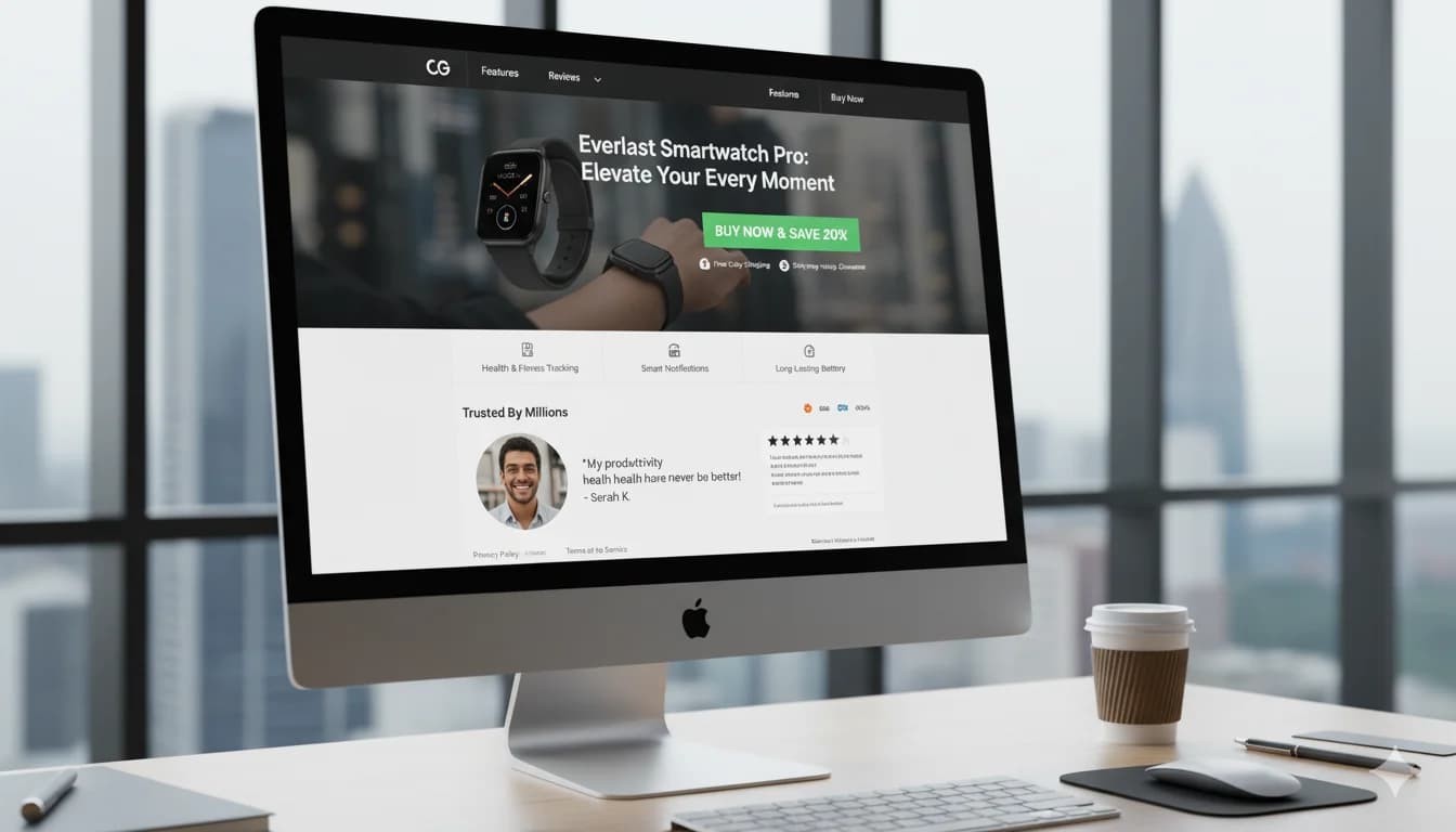
Above the Fold (first 600px, no scrolling)
[Logo] [Navigation (minimal!)] [Phone/Chat]

[Compelling Headline]
[Subheadline with main benefits]

[Hero Image/Video]    [CTA Button (large)]
                      [Trust signals (reviews)]
Critical: Everything a user needs to convert should be visible without scrolling!
Mid-Section (after scroll)
[Benefits Section]
- Why us?
- What makes us different?
- Main advantages (3-5 bullets)

[Social Proof]
- Customer reviews (min. 3-5)
- Logos from known clients
- Press mentions

[Product/Service Details]
- Specific features (with benefit explanations!)
- Possibly comparison table
Bottom Section (before footer)
[FAQ Section]
- 5-10 most common questions
- Addresses objections

[Final CTA]
- Repeat CTA (same as above-the-fold)
- With urgency/scarcity ("Only 3 left in stock!")

[Trust signals one more time]
- Return policy
- Guarantees
- Security badges
Conversion Rate Optimization (CRO) Techniques
Technique 1: Headline Optimization
A/B Test:
Variant A (generic):
"Running Shoes for Men"
CR: 2.5%
Variant B (specific):
"Nike Air Max 2024 Men - 30% Off + Free Shipping"
CR: 4.2% (+68%!)
Test variants:
- With/without discount
- With/without urgency
- With/without social proof in headline
Technique 2: Remove Distractions
❌ Problem: Navigation with 20 links, sidebar with 10 widgets → User has 30 options, not focused on conversion
✅ Solution: Minimal distractions
- No navigation (or minimal: Logo, Phone, CTA)
- No sidebar
- No external links (no leaving the page!)
- One goal: Conversion!
A/B Test: Full navigation vs. minimal navigation Result: Often +20-40% CR with minimal navigation
Technique 3: Above-the-Fold CTA
Problem: CTA only at bottom → users leave before seeing it
Solution: CTA visible without scrolling (above-the-fold)
Test: CTA above vs. only below Typical lift: +30-50% conversions
But: Also CTA at bottom (for those who scroll)!
Technique 4: Form Optimization
Rule: Fewer fields = higher conversion
A/B Test:
Variant A (12 fields):
First name, last name, street, house number, zip code, city,
phone, email, company, position, industry, message
CR: 3%
Variant B (3 fields):
Name, email, phone
CR: 7.5% (+150%!)
Recommendation:
- E-Commerce: Only necessary fields (email, shipping address)
- Lead-Gen: Max. 3-5 fields
- B2B (high-ticket): 5-8 fields ok (qualify leads)
Form optimization tips:
- Show field count ("Step 1 of 3")
- Auto-complete (address, city)
- Real-time validation (error messages immediately)
- Large fields on mobile (min. 48px height)
Technique 5: Mobile Optimization
The majority of searches happen on mobile!
Mobile checklist:
✅ Responsive Design:
- No horizontal scrolling
- Text readable without zooming (min. 16px)
- Buttons large enough (min. 48x48px)
✅ Mobile Page Speed:
- < 2 seconds on 3G
- Test: PageSpeed Insights (Mobile tab)
✅ Click-to-Call:
<a href="tel:+491234567890">
  Call now: 0123-456789
</a>
→ One tap = call
✅ Forms minimized:
- Max. 3-5 fields
- Large input fields
- Use mobile keyboard types (email, tel, number)
Technique 6: Loading Speed Optimization
Reality: In my experience, every extra second of loading time noticeably drops conversions!
Loading time vs. Conversion Rate:
0-1 sec: 100% baseline
1-2 sec: -10%
2-3 sec: -20%
3-5 sec: -40%
5+ sec: -60%
Speed optimization:
1. Image compression:
Tool: TinyPNG.com
Before: 5 MB → After: 500 KB (90% smaller!)
2. Lazy loading:
<img src="image.jpg" loading="lazy" />
→ Images load only when visible
3. CDN (Content Delivery Network):
Cloudflare (free) → 30-50% faster
4. Minify CSS/JS:
Remove whitespace, compress code
5. Browser caching:
Images/CSS/JS cached for days/months
Goal: < 2 seconds = excellent
Technique 7: Urgency & Scarcity
Why it works: FOMO (Fear of Missing Out)
Urgency (time-limited):
✅ "Sale ends in: [Countdown: 23:45:12]"
✅ "Only today: 30% off"
✅ "Offer valid until midnight"
Scarcity (quantity-limited):
✅ "Only 3 left in stock"
✅ "12 people viewing this product right now"
✅ "Only 5 spots left for free consultation"
Warning: Must be genuine! Fake urgency = trust loss
A/B Test: With vs. without urgency Typical lift: +15-30% conversions
Technique 8: Exit-Intent Popups
What: Popup appears when user is about to leave
Offer:
"Wait! Get 10% off your first order"
[Email field] [Button: "Get discount now"]
Best Practice:
- Only on exit (not immediately after entry!)
- Clear benefit (discount, free shipping)
- Easy to close (X button)
- Not too intrusive
Performance: 2-5% of exiting visitors convert
Tools: OptinMonster, Sumo, Poptin
A/B Testing: What to test
Prioritization (highest impact first):
High Impact (test first):
- Headline (biggest lever!)
- CTA button (text, color, size)
- Hero image/video
- Form length (fields)
- Page layout (one-column vs. sidebar)
Medium Impact: 6. Subheadline 7. Trust elements (types, position) 8. Benefits vs. features 9. Social proof (testimonials position) 10. Color scheme
Low Impact (test later): 11. Font size 12. Footer content 13. Secondary CTAs
A/B Testing Tools:
- Google Optimize (free, but discontinued 2024)
- Optimizely (from €200/month)
- VWO (from €200/month)
- Convert (from €99/month)
Testing duration: Min. 2-4 weeks or 100+ conversions per variant
Common Landing Page Mistakes
Mistake 1: Generic landing page (homepage)
❌ Problem: Google Ad for "Nike Air Max" → Homepage (all products) ✅ Solution: Dedicated landing page per ad group
Mistake 2: Message mismatch
❌ Problem: Ad: "20% off running shoes" → Landing page: No mention of discount ✅ Solution: Ad message = landing page headline (consistency!)
Mistake 3: Too many options
❌ Problem: 20 products on one page → choice paralysis ✅ Solution: 1-3 products or clear primary CTA
Mistake 4: No trust elements
❌ Problem: No reviews, no guarantees, no security badges ✅ Solution: Multiple trust signals (reviews, badges, guarantees)
Mistake 5: Slow loading
❌ Problem: 5+ seconds loading time → 60% bounce ✅ Solution: < 2 seconds (image optimization, CDN)
Mistake 6: No mobile optimization
❌ Problem: Desktop-only design, tiny CTA buttons on mobile ✅ Solution: Mobile-first design, test on real devices
Mistake 7: Overwhelming forms
❌ Problem: 12 fields for simple newsletter signup ✅ Solution: Max. 3-5 fields (less is more!)
Industry-Specific Landing Page Best Practices
E-Commerce
Must-Haves:
- Product images (min. 3-5, high-res)
- Price (prominent)
- "Add to Cart" CTA (large, contrasting)
- Trust signals (free shipping, returns, reviews)
- Product details (size, color, material)
Nice-to-Haves:
- Product video
- 360° view
- "Customers also bought" (cross-sell)
- Live chat
Lead-Gen (B2B/B2C)
Must-Haves:
- Clear value proposition (what do they get?)
- Short form (3-5 fields)
- Privacy notice (GDPR!)
- Guarantee ("No spam", "No obligations")
Nice-to-Haves:
- Case studies
- Client logos
- Testimonials with photos
- Process explanation ("What happens after?")
SaaS
Must-Haves:
- "Free Trial" CTA (not "Sign Up")
- Feature highlights (3-5 main benefits)
- Screenshots/Demo video
- Pricing (transparent)
- Social proof (customer count, reviews)
Nice-to-Haves:
- Product tour
- Live demo booking
- Comparison with competitors
- Security badges (SOC 2, ISO)
Local Services
Must-Haves:
- Phone number (large, click-to-call)
- Service area (which cities/regions?)
- Availability ("24/7" or opening hours)
- Before/After photos (results)
- Local reviews (Google, Facebook)
Nice-to-Haves:
- Online booking
- Map integration
- Team photos ("Meet the team")
- Certifications (TÜV, professional association)
Landing Page Checklist
Pre-Launch ✅:
- [ ] Headline is clear and benefit-driven
- [ ] CTA above-the-fold visible
- [ ] CTA text action-oriented ("Get", not "Click here")
- [ ] Hero image/video relevant and high-quality
- [ ] Trust elements present (reviews, badges)
- [ ] Form optimized (max. 5 fields)
- [ ] Mobile responsive
- [ ] Loading time < 2 seconds
- [ ] No navigation distractions
- [ ] Message matches ad
- [ ] GDPR compliant (privacy policy, cookie banner)
Post-Launch ✅:
- [ ] Conversion tracking works
- [ ] A/B tests running (headline, CTA)
- [ ] Heat maps installed (Hotjar, Crazy Egg)
- [ ] Weekly performance review
- [ ] User feedback collection
Tools for Landing Page Optimization
Landing Page Builders:
- Unbounce (from €90/month) - No-code builder
- Instapage (from €199/month) - Many templates
- Leadpages (from €49/month) - Budget-friendly
- WordPress + Elementor (one-time €50) - Full control
A/B Testing:
- VWO (from €200/month)
- Optimizely (from €300/month)
- Google Optimize (free, discontinued 2024)
Analytics & Heatmaps:
- Hotjar (from €39/month) - Heatmaps, recordings
- Crazy Egg (from €29/month)
- Google Analytics 4 (free)
Speed Testing:
- Google PageSpeed Insights (free)
- GTmetrix (free)
- WebPageTest (free)
Conclusion
Landing page optimization = highest ROI lever in Google Ads
Priority roadmap:
Week 1 (Quick Wins):
- ✅ Headline optimization (ad message match)
- ✅ CTA above-the-fold
- ✅ Trust elements added (reviews, badges)
Week 2-4 (Structure):
- ✅ Remove navigation distractions
- ✅ Form optimization (fewer fields)
- ✅ Mobile optimization
Month 2-3 (Testing):
- ✅ A/B testing (headline, CTA, images)
- ✅ Heat maps analysis
- ✅ Speed optimization
Expectation: 50-150% conversion rate increase in 2-3 months!
Landing Page Optimization Support
FAQ on Landing Page Optimization
What makes a good landing page?
7 essential elements: 1) Compelling headline (ad message match, benefit-driven), 2) Clear CTA above-the-fold (action-oriented, contrasting color), 3) Hero image/video (product in use, high-quality), 4) Trust signals (reviews, badges, guarantees), 5) Benefits (not features!), 6) Social proof (testimonials, customer count), 7) Minimal distractions (no navigation, focused). Structure: Above-the-fold has everything for conversion (no scrolling needed). Mobile optimized (<2 sec load time).
How can I increase my landing page conversion rate?
Top 5 techniques: 1) Headline optimization (specific, benefit-driven, urgency) → often +30-50% CR, 2) Remove distractions (minimal navigation, no sidebar) → +20-40%, 3) Above-the-fold CTA (visible without scrolling) → +30-50%, 4) Form reduction (12 → 3 fields) → +50-150%, 5) Speed optimization (<2 sec) → every extra second typically costs conversions. Start with headline + CTA, then structure, then A/B testing. Timeline: 50-150% CR increase in 2-3 months realistic.
What should I A/B test first on my landing page?
Priority (highest impact first): 1) Headline (biggest lever!), test variations with/without discount, urgency, social proof. 2) CTA button (text "Buy now" vs "Get offer", color, size). 3) Hero image/video (product vs lifestyle vs before/after). 4) Form length (12 vs 5 vs 3 fields). 5) Page layout (one-column vs sidebar). Don't test: Font sizes, footer content (low impact). Testing duration: Min. 2-4 weeks or 100+ conversions per variant. Tool: VWO, Optimizely, or Google Optimize.
How important is page speed for conversions?
VERY important! In my experience, every extra second of loading time noticeably lowers conversions. Rough benchmarks: 0-1 sec: Excellent (100% baseline), 1-2 sec: Good (-10%), 2-3 sec: Ok (-20%), 3-5 sec: Bad (-40%), 5+ sec: Terrible (-60%). Quick fixes: 1) Image compression (TinyPNG), 2) CDN (Cloudflare free), 3) Lazy loading, 4) Browser caching, 5) Minify CSS/JS. Goal: <2 seconds. Test: Google PageSpeed Insights. Mobile especially critical (76% searches on mobile!).
What's the ideal form length?
Less is more! E-Commerce: Only necessary (email, shipping) = 5-7 fields max. Lead-Gen: 3-5 fields optimal (name, email, phone). B2B high-ticket: 5-8 ok (qualify leads). Each additional field: -10-15% conversion. A/B test example: 12 fields → 3% CR vs 3 fields → 7.5% CR (+150%!). Tips: Show progress ("Step 1 of 3"), auto-complete, real-time validation, large fields on mobile (48px+).
Should my landing page have navigation?
NO (usually)! With navigation: 30 links → user has 30 options, distracted. Without: 1 goal = conversion (focused!). A/B test: Full navigation vs minimal (just logo + phone + CTA) → often +20-40% CR with minimal. Exception: E-Commerce sites (users expect navigation). For dedicated landing pages from ads: Minimal or no navigation. Alternative: Sticky CTA button replaces navigation.
How do I make my landing page mobile-friendly?
Mobile checklist: 1) Responsive design (no horizontal scroll, text min. 16px, buttons min. 48x48px), 2) Speed <2 sec on 3G (test: PageSpeed Insights Mobile), 3) Click-to-call phone (one tap = call), 4) Large form fields (48px+ height), 5) Minimal form length (max 3-5 fields on mobile). Test: Real devices (iPhone, Android) not just desktop browser resize! The majority of searches happen on mobile → mobile = priority, not afterthought.
What trust elements should I include?
7 effective trust signals: 1) Customer reviews (★★★★★ 4.8/5 - X reviews), 2) Client logos ("Trusted by: [company logos]"), 3) Certificates (TÜV, ISO, awards), 4) Security badges (SSL, secure payment), 5) Money-back guarantee ("30-day guarantee"), 6) Free shipping/returns, 7) Press mentions ("As seen on: [magazines]"). Position: Throughout page, especially near CTA. Minimum: 3-4 different types. Without trust elements: -30-50% conversions (users skeptical!).

Mijo Jurisic
Google Ads consultant & founder of MJ Marketing. Five-plus years of hands-on practice — from a self-taught start to the Google Premier Partner programme with 500+ direct Google Ads clients and €20M+ in managed media spend.
Share this article: