

Landing Page Optimization for Google Ads: More Conversions from Every Click
In my experience: Same ads, better landing page, noticeably more conversions. Many advertisers pour money into ads while the landing page quietly loses the clicks they already paid for. This guide shows how to optimize landing pages for a higher conversion rate.
Why Landing Page Optimization is the highest ROI lever
Example "before/after" (illustrative numbers):
Before optimization:
Budget: €5,000/month
Clicks: 2,500
Conversion Rate: 2%
Conversions: 50
CPA: €100
After optimization (same ads, same budget!):
Budget: €5,000/month
Clicks: 2,500
Conversion Rate: 5% (+150%!)
Conversions: 125 (+150%!)
CPA: €40 (-60%!)
The difference: €0 more budget, 75 more conversions!
Better than:
- New keywords (more expensive)
- Higher bids (more expensive)
- More budget (more expensive)
Landing page optimization = free performance boost!
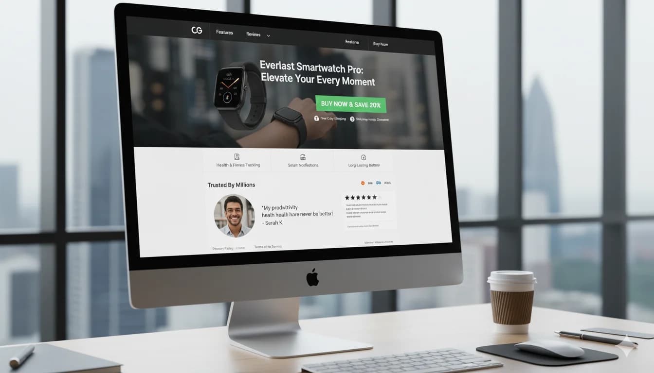
The Anatomy of a High-Converting Landing Page
7 Essential Elements:
1. Headline (most important!)
Job: Attention + Relevance in 3 seconds
❌ Bad:
"Welcome to our website"
→ Generic, no value
✅ Good:
"Nike Air Max 2024 - 30% Off Only Today"
→ Specific, clear value, urgency
Formula: [Product/Benefit] + [Unique Value Proposition] + [Urgency/Social Proof]
Examples:
E-Commerce: "Free Shipping on Orders Over €50 - 30-Day Return Policy"
B2B SaaS: "Automate Your Accounting in 15 Minutes - Free Trial"
Lead-Gen: "Free Kitchen Quote in 24h - 500+ Satisfied Customers"
2. Subheadline
Job: Expand headline, more details
✅ Good:
Headline: "Nike Air Max 2024 - 30% Off"
Subheadline: "Limited stock - over 10,000 satisfied customers. Free shipping from €50."
3. Hero Image/Video
What works:
- Product in use (not just product image!)
- Happy customers (social proof)
- Before/After (transformation)
- High resolution (min. 1920px wide)
❌ What doesn't work:
- Stock photos (generic models)
- Blurry images
- Irrelevant imagery
Video: often worth testing against a static image, especially for products that need explaining
- 30-90 seconds
- Show product in use
- With customer testimonials
4. Call-to-Action (CTA)
Job: Tell user what to do
❌ Bad:
"Click here"
"Submit"
"Continue"
✅ Good:
"Get 30% Off Now"
"Start Free Trial"
"Get Free Quote"
Best Practices:
- Action verb ("Get", "Start", "Download")
- Benefit mentioned ("Free", "Now", "Today")
- Contrasting color (stands out!)
- Large (min. 48px height on mobile)
- Above the fold visible
A/B Test: CTA color, text, size
5. Trust Elements
Why important: "Can I trust this company?"
Trust signals:
✅ Customer reviews (★★★★★ 4.8/5 - 1,234 reviews)
✅ Logos from known clients ("Trusted by: [Logos]")
✅ Certificates (TÜV, ISO, awards)
✅ Security badges (SSL, secure payment)
✅ Money-back guarantee ("30-day money-back guarantee")
✅ Free shipping/returns
✅ Press mentions ("As seen on: [Magazine logos]")
Position: Throughout page, especially near CTA
6. Benefits (not Features!)
❌ Feature-focused (technical):
"Nike Air Max with Air cushioning technology"
✅ Benefit-focused (customer value):
"Run longer without joint pain thanks to revolutionary cushioning"
Formula: Feature → What it means for the customer
Examples:
Feature: "24/7 customer support"
Benefit: "Help whenever you need it - even at night"

Feature: "Cloud-based software"
Benefit: "Work from anywhere - office, home, or on the go"

Feature: "30-day return policy"
Benefit: "Try risk-free - full money back if not satisfied"
7. Social Proof
Types:
Customer testimonials:
"These running shoes changed my training! After 3 months, no more knee pain."
- Sarah M., Munich
★★★★★
Case studies (B2B):
"How Company X increased sales by 180% in 6 months"
[PDF Download]
Numbers:
"Over 50,000 satisfied customers"
"4.9 out of 5 stars from 2,341 reviews"
"Test winner 2024 in [trade magazine]" (only if true and citable)
Position: Multiple places (headline, mid-page, before CTA)
Landing Page Structure: The Conversion Funnel
Template for high conversion:
Above the Fold (first 600px, no scrolling)
[Logo] [Navigation (minimal!)] [Phone/Chat]

[Compelling Headline]
[Subheadline with main benefits]

[Hero Image/Video]    [CTA Button (large)]
                      [Trust signals (reviews)]
Critical: Everything a user needs to convert should be visible without scrolling!
Mid-Section (after scroll)
[Benefits Section]
- Why us?
- What makes us different?
- Main advantages (3-5 bullets)

[Social Proof]
- Customer reviews (min. 3-5)
- Logos from known clients
- Press mentions

[Product/Service Details]
- Specific features (with benefit explanations!)
- Possibly comparison table
Bottom Section (before footer)
[FAQ Section]
- 5-10 most common questions
- Addresses objections

[Final CTA]
- Repeat CTA (same as above-the-fold)
- With urgency/scarcity ("Only 3 left in stock!")

[Trust signals one more time]
- Return policy
- Guarantees
- Security badges
Conversion Rate Optimization (CRO) Techniques
Technique 1: Headline Optimization
A/B Test (illustrative numbers):
Variant A (generic):
"Running Shoes for Men"
CR: 2.5%
Variant B (specific):
"Nike Air Max 2024 Men - 30% Off + Free Shipping"
CR: 4.2% (+68%!)
Test variants:
- With/without discount
- With/without urgency
- With/without social proof in headline
Technique 2: Remove Distractions
❌ Problem: Navigation with 20 links, sidebar with 10 widgets → User has 30 options, not focused on conversion
✅ Solution: Minimal distractions
- No navigation (or minimal: Logo, Phone, CTA)
- No sidebar
- No external links (no leaving the page!)
- One goal: Conversion!
A/B Test: Full navigation vs. minimal navigation In my experience: The minimal version often wins, but only your own test shows by how much
Technique 3: Above-the-Fold CTA
Problem: CTA only at bottom → users leave before seeing it
Solution: CTA visible without scrolling (above-the-fold)
Test: CTA above vs. only below In my experience: A visible CTA above the fold is one of the most dependable wins on a landing page
But: Also CTA at bottom (for those who scroll)!
Technique 4: Form Optimization
Rule: Fewer fields = higher conversion
A/B Test (illustrative numbers):
Variant A (12 fields):
First name, last name, street, house number, zip code, city,
phone, email, company, position, industry, message
CR: 3%
Variant B (3 fields):
Name, email, phone
CR: 7.5% (+150%!)
Recommendation:
- E-Commerce: Only necessary fields (email, shipping address)
- Lead-Gen: Max. 3-5 fields
- B2B (high-ticket): 5-8 fields ok (qualify leads)
Form optimization tips:
- Show field count ("Step 1 of 3")
- Auto-complete (address, city)
- Real-time validation (error messages immediately)
- Large fields on mobile (min. 48px height)
Clear labels and understandable error messages are also accessibility issues: when your landing page falls under the German Accessibility Act (BFSG) and what you should check then is covered in my guide German Accessibility Act (BFSG) for landing pages.
Technique 5: Mobile Optimization
In many accounts, most clicks come from smartphones. You can check your share in Google Ads via Segment > Device.
Mobile checklist:
✅ Responsive Design:
- No horizontal scrolling
- Text readable without zooming (min. 16px)
- Buttons large enough (min. 48x48px)
✅ Mobile Page Speed:
- < 2 seconds on 3G
- Test: PageSpeed Insights (Mobile tab)
✅ Click-to-Call:
<a href="tel:+491234567890">
  Call now: 0123-456789
</a>
→ One tap = call
✅ Forms minimized:
- Max. 3-5 fields
- Large input fields
- Use mobile keyboard types (email, tel, number)
Technique 6: Loading Speed Optimization
Reality: In my experience, every extra second of loading time noticeably drops conversions!
How much it costs you: There is no universal curve. Measure your own page speed and conversion rate before and after each speed fix, then you know what a second is worth on your page.
Speed optimization:
1. Image compression:
Tool: TinyPNG.com
Before: 5 MB → After: 500 KB (90% smaller!)
2. Lazy loading:
<img src="image.jpg" loading="lazy" />
→ Images load only when visible
3. CDN (Content Delivery Network):
Cloudflare (free) → files served from servers close to your visitors
4. Minify CSS/JS:
Remove whitespace, compress code
5. Browser caching:
Images/CSS/JS cached for days/months
Goal: < 2 seconds = excellent
Technique 7: Urgency & Scarcity
Why it works: FOMO (Fear of Missing Out)
Urgency (time-limited):
✅ "Sale ends in: [Countdown: 23:45:12]"
✅ "Only today: 30% off"
✅ "Offer valid until midnight"
Scarcity (quantity-limited):
✅ "Only 3 left in stock"
✅ "12 people viewing this product right now"
✅ "Only 5 spots left for free consultation"
Warning: Must be genuine! Fake urgency = trust loss
A/B Test: With vs. without urgency In my experience: Genuine urgency can lift conversions, fake urgency costs you trust
Technique 8: Exit-Intent Popups
What: Popup appears when user is about to leave
Offer:
"Wait! Get 10% off your first order"
[Email field] [Button: "Get discount now"]
Best Practice:
- Only on exit (not immediately after entry!)
- Clear benefit (discount, free shipping)
- Easy to close (X button)
- Not too intrusive
Performance: Only a small share of exiting visitors converts, but these are people you would otherwise lose completely. Weigh that against the annoyance factor
Tools: OptinMonster, Sumo, Poptin
A/B Testing: What to test
Prioritization (highest impact first):
High Impact (test first):
- Headline (biggest lever!)
- CTA button (text, color, size)
- Hero image/video
- Form length (fields)
- Page layout (one-column vs. sidebar)
Medium Impact: 6. Subheadline 7. Trust elements (types, position) 8. Benefits vs. features 9. Social proof (testimonials position) 10. Color scheme
Low Impact (test later): 11. Font size 12. Footer content 13. Secondary CTAs
A/B Testing Tools:
- Optimizely (from €200/month)
- VWO (from €200/month)
- Convert (from €99/month)
Google Optimize is no longer an option: Google shut it down on 30 September 2023.
Testing duration (rule of thumb from my practice): at least 2-4 weeks or 100+ conversions per variant. Whether a difference is statistically significant depends on the size of the effect, so check it with a significance calculator.
Common Landing Page Mistakes
Mistake 1: Generic landing page (homepage)
❌ Problem: Google Ad for "Nike Air Max" → Homepage (all products) ✅ Solution: Dedicated landing page per ad group
Mistake 2: Message mismatch
❌ Problem: Ad: "20% off running shoes" → Landing page: No mention of discount ✅ Solution: Ad message = landing page headline (consistency!)
Mistake 3: Too many options
❌ Problem: 20 products on one page → choice paralysis ✅ Solution: 1-3 products or clear primary CTA
Mistake 4: No trust elements
❌ Problem: No reviews, no guarantees, no security badges ✅ Solution: Multiple trust signals (reviews, badges, guarantees)
Mistake 5: Slow loading
❌ Problem: 5+ seconds loading time → many visitors leave before the page appears ✅ Solution: < 2 seconds (image optimization, CDN)
Mistake 6: No mobile optimization
❌ Problem: Desktop-only design, tiny CTA buttons on mobile ✅ Solution: Mobile-first design, test on real devices
Mistake 7: Overwhelming forms
❌ Problem: 12 fields for simple newsletter signup ✅ Solution: Max. 3-5 fields (less is more!)
Industry-Specific Landing Page Best Practices
E-Commerce
Must-Haves:
- Product images (min. 3-5, high-res)
- Price (prominent)
- "Add to Cart" CTA (large, contrasting)
- Trust signals (free shipping, returns, reviews)
- Product details (size, color, material)
Nice-to-Haves:
- Product video
- 360° view
- "Customers also bought" (cross-sell)
- Live chat
Lead-Gen (B2B/B2C)
Must-Haves:
- Clear value proposition (what do they get?)
- Short form (3-5 fields)
- Privacy notice (GDPR!)
- Guarantee ("No spam", "No obligations")
Nice-to-Haves:
- Case studies
- Client logos
- Testimonials with photos
- Process explanation ("What happens after?")
SaaS
Must-Haves:
- "Free Trial" CTA (not "Sign Up")
- Feature highlights (3-5 main benefits)
- Screenshots/Demo video
- Pricing (transparent)
- Social proof (customer count, reviews)
Nice-to-Haves:
- Product tour
- Live demo booking
- Comparison with competitors
- Security badges (SOC 2, ISO)
Local Services
Must-Haves:
- Phone number (large, click-to-call)
- Service area (which cities/regions?)
- Availability ("24/7" or opening hours)
- Before/After photos (results)
- Local reviews (Google, Facebook)
Nice-to-Haves:
- Online booking
- Map integration
- Team photos ("Meet the team")
- Certifications (TÜV, professional association)
Landing Page Checklist
Pre-Launch ✅:
- Headline is clear and benefit-driven
- CTA above-the-fold visible
- CTA text action-oriented ("Get", not "Click here")
- Hero image/video relevant and high-quality
- Trust elements present (reviews, badges)
- Form optimized (max. 5 fields)
- Mobile responsive
- Loading time < 2 seconds
- No navigation distractions
- Message matches ad
- GDPR compliant (privacy policy, cookie banner)
Post-Launch ✅:
- Conversion tracking works
- A/B tests running (headline, CTA)
- Heat maps installed (Hotjar, Crazy Egg)
- Weekly performance review
- User feedback collection
Tools for Landing Page Optimization
Landing Page Builders:
- Unbounce (from €90/month) - No-code builder
- Instapage (from €199/month) - Many templates
- Leadpages (from €49/month) - Budget-friendly
- WordPress + Elementor (one-time €50) - Full control
A/B Testing:
- VWO (from €200/month)
- Optimizely (from €300/month)
Analytics & Heatmaps:
- Hotjar (from €39/month) - Heatmaps, recordings
- Crazy Egg (from €29/month)
- Google Analytics 4 (free)
Speed Testing:
- Google PageSpeed Insights (free)
- GTmetrix (free)
- WebPageTest (free)
Conclusion
Landing page optimization = highest ROI lever in Google Ads
Priority roadmap:
Week 1 (Quick Wins):
- Headline optimization (ad message match)
- CTA above-the-fold
- Trust elements added (reviews, badges)
Week 2-4 (Structure):
- Remove navigation distractions
- Form optimization (fewer fields)
- Mobile optimization
Month 2-3 (Testing):
- A/B testing (headline, CTA, images)
- Heat maps analysis
- Speed optimization
Expectation: Nobody can honestly promise you a fixed increase. In my experience, a few solid wins from this roadmap add up to a noticeably better conversion rate over the following months.
Landing Page Optimization Support
FAQ on Landing Page Optimization
What makes a good landing page?
7 essential elements: 1) Compelling headline (ad message match, benefit-driven), 2) Clear CTA above-the-fold (action-oriented, contrasting color), 3) Hero image/video (product in use, high-quality), 4) Trust signals (reviews, badges, guarantees), 5) Benefits (not features!), 6) Social proof (testimonials, customer count), 7) Minimal distractions (no navigation, focused). Structure: Above-the-fold has everything for conversion (no scrolling needed). Mobile optimized (<2 sec load time).
How can I increase my landing page conversion rate?
Top 5 techniques: 1) Headline optimization (specific, benefit-driven, matching the ad), 2) Remove distractions (minimal navigation, no sidebar), 3) Above-the-fold CTA (visible without scrolling), 4) Form reduction (only the fields you really need), 5) Speed optimization (<2 sec), since every extra second typically costs conversions. Start with headline + CTA, then structure, then A/B testing. How much each step brings depends on your starting point, so measure every change against your baseline.
What should I A/B test first on my landing page?
Priority (highest impact first): 1) Headline (biggest lever!), test variations with/without discount, urgency, social proof. 2) CTA button (text "Buy now" vs "Get offer", color, size). 3) Hero image/video (product vs lifestyle vs before/after). 4) Form length (12 vs 5 vs 3 fields). 5) Page layout (one-column vs sidebar). Don't test: Font sizes, footer content (low impact). Testing duration (rule of thumb from my practice): at least 2-4 weeks or 100+ conversions per variant, then check significance with a calculator. Tool: VWO, Optimizely or Convert.
How important is page speed for conversions?
VERY important! In my experience, every extra second of loading time noticeably lowers conversions. There is no universal curve, so measure your own page before and after each fix. Quick fixes: 1) Image compression (TinyPNG), 2) CDN (Cloudflare free), 3) Lazy loading, 4) Browser caching, 5) Minify CSS/JS. Goal: <2 seconds. Test: Google PageSpeed Insights. Mobile especially critical (in many accounts, most of the traffic).
What's the ideal form length?
Less is more! E-Commerce: Only necessary (email, shipping) = 5-7 fields max. Lead-Gen: 3-5 fields optimal (name, email, phone). B2B high-ticket: 5-8 ok (qualify leads). Each additional field is one more reason to drop off, so ask only for what you need for the next step. Tips: Show progress ("Step 1 of 3"), auto-complete, real-time validation, large fields on mobile (48px+).
Should my landing page have navigation?
NO (usually)! With navigation: 30 links → user has 30 options, distracted. Without: 1 goal = conversion (focused!). A/B test: Full navigation vs minimal (just logo + phone + CTA) → in my experience, the minimal version often wins. Exception: E-Commerce sites (users expect navigation). For dedicated landing pages from ads: Minimal or no navigation. Alternative: Sticky CTA button replaces navigation.
How do I make my landing page mobile-friendly?
Mobile checklist: 1) Responsive design (no horizontal scroll, text min. 16px, buttons min. 48x48px), 2) Speed <2 sec on 3G (test: PageSpeed Insights Mobile), 3) Click-to-call phone (one tap = call), 4) Large form fields (48px+ height), 5) Minimal form length (max 3-5 fields on mobile). Test: Real devices (iPhone, Android) not just desktop browser resize! In many accounts, most clicks come from smartphones → mobile = priority, not afterthought.
What trust elements should I include?
7 effective trust signals: 1) Customer reviews (★★★★★ 4.8/5 - X reviews), 2) Client logos ("Trusted by: [company logos]"), 3) Certificates (TÜV, ISO, awards), 4) Security badges (SSL, secure payment), 5) Money-back guarantee ("30-day guarantee"), 6) Free shipping/returns, 7) Press mentions ("As seen on: [magazines]"). Position: Throughout page, especially near CTA. Minimum: 3-4 different types. Without trust elements, users stay skeptical and convert less.